Showing posts with label css. Show all posts

Sunday, October 26, 2008

Don't Ever Put Block Inside Inline Elements

It's been incredibly busy at work so I haven't blogged at all in over two months.

I did discover something which may seem obvious to you, but is worth repeating. Don't ever put block elements inside inline elements. If you do, in most cases, nothing bad will happen. If you do, watch out. It's better not to do it. Here's what the W3C spec says.
Probably many of us do it anyways and it seems to work, but it's "go
to hell" incorrect. Block elements visually begin on a new line.
They can contain inline and other block-level elements ( div, p, ul,
etc. ). Inline elements visually don't begin on a new line. They
contain only text and other inline elements ( span, a, img, etc. ).

Take this example of the two Colas --


Visually, they look identical, but study the HTML and you'll see that they're constructed differently.

Block in Inline Element
<a href="#">
<img src="./captainColaHeadShot.jpg">
<div class="title">Cola the Yorkie BAD</div>
<div>Inline containing a block element. This is bad!</div>
</a>

Inline in Block Element
<a href="#">
<img src="./captainColaHeadShot.jpg">
<span class="title">Cola the Yorkie GOOD</span>
<span>Inline containing an inline element. This is good!</span>
</a>
So, what's the big deal? After all, it works. Well, sort of.

You'll need a couple of things to see what I mean. First, you'll need to run the example in Firefox 2.x or 3.x, but before you do that make sure you've installed Firebug. Now, using Firebug, inspect and edit the text "Inline containing a block element. This is bad!" that's found in the div. Just type in some additional text like "Hello world!" or just anything. Now, inspect the div. You'll notice that the text is now contained inside an anchor tag which is inside the div! What happened?

I'm not sure, but I think Firefox attempts to correct the HTML by putting an inline inside a block-level element ( here's a really good writeup on invalid markup funkiness among the browsers ). If you try the same thing ( editing the text for "Inline containing a block element. This is good!" ), you won't observe this problem. This is because the markup is correct -- we've got a block-level element containing an inline element.

So, in my real job I saw this funkiness happen. Every once in a blue moon on page refresh, the text would be found in an mysterious anchor tag creating an ugly "blown" up visual. Correcting the markup fixed this problem for good.

You might be wondering what's the difference between a block-level element ( <div> ) and using CSS to make an inline element a block-level element ( <span style="display:block;"> ).

If an element by default -- like a div -- is a block-level element then it cannot be placed inside an inline element. However, an inline element made into a block-level element via CSS can be placed inside an inline element. This is because the style that's applied is irrelevant to the correctness of the markup. In other words, styling is our stated intention for what the element should look like and that's completely separate from valid markup.

Have fun!

Monday, June 30, 2008

On the Importance of Clearing Floats

I've been doing a lot of work with the Big Three of web development -- HTML, CSS and JavaScript. Prior to Yahoo!, I had done a lot of work with Bindows, a powerful "do everything" JavaScript framework. You built your entire web application with Bindows. You never manipulated HTML or CSS directly. It was all abstracted for you with their API.

I loved working with Bindows. It allowed me to improve my JavaScript skills and to build some really cool prototypes. Unfortunately, one of the niceties of Bindows -- that of abstraction and protecting you from the details of HTML and CSS -- turned out to be a real detriment for me.

My HTML and CSS skills suffered, but more importantly, to really fine tune the layout, you have to have access to the underlying structure and presentation layer.

Even some of the most basic and important concepts such as the importance of using and clearing floats weren't etched into my brain until I stepped foot at Yahoo!. I had read about it, understood enough to recognize it ( at least pass the interview ), but it wasn't until I really started doing hardcore development that I realized that to control layout means to control how things flow on the page and that meant understanding how to float and clear elements.

In fact, understanding floats is probably THE most important thing that you need to know when using HTML and CSS. Arguably, there are a bunch of other things that are also important such as knowing how to invoke hasLayout for IE, but I've found that a lot of the layout problems can be fixed by knowing when to clear floats.

When you float an element, you position an element to the left or right of another element. It's a very effective and fundamental way to position elements. Here's an example.

We're floating only two elements. The first is the entire "Left Side" div. It's floated to the left of the "Right Side" div. The second, is the image of Cola, the Yorkshire Terrier. That's floated to the left of the descriptive text. Everything is nicely formatted in Firefox, Safari, Opera and IE7 ( I haven't tried IE6, but it should work there as well ).

If you use Firebug, you'll see that we "clear floats" in three places --
  • At the container level -- this is the div with class "container" that contains the "Left Side" and the "Right Side" divs
  • The "Right Side" div -- this is the div with the class "right-stories"
  • The list element found inside the "Right Side" div
When we clear floats we put elements back into the flow so that they don't flow outside of the layout. There are many ways to clear floats, but the easiest way that I've found is to set the CSS property overflow to hidden. A good writeup of that technique is found here. It's found near the end.

So using Firebug, look for "overflow:hidden" and disable all of it. The elements overrun their borders and resembles a jumbled mish-mash of elements and seem to defy the box model. Here it is.

Whenever you observe strange layout like that, make sure that you're clearing your floats. Remember, floated elements come out of the flow so adjacent or containing elements need to set overflow so that all elements fall back into position. Think of setting overflow:hidden as getting all the misbehaving elements back into line.

Note that you can observe this visually, but you can also use Firebug and inspect the element. Hover over the element and if that element overlays another, that element is out of the flow. If you can identify and fix float issues, you'll be King for a Day!

Have fun!

Monday, April 14, 2008

Cross Browser Rounded Borders Using Sprites

I was reviewing techniques for rounded borders and came across this. It uses four background images for each of the corners; however, they're not using a sprite. So, we'll do it with a single sprite. Once we're done, we'll have something like this that works on all the major browsers ( IE6/IE7, Firefox, Safari and Opera ) --


First, we'll take the four corner GIF images that they have, make them transparent ( using a bitmap editor ) and then use a sprite generator to create our sprite as well as the supporting CSS. I like to use the one from Website Performance.

Next, we'll take the layered approach which means that we'll nest absolutely positioned elements in a relatively positioned container. So, the four corners, the two horizontal and vertical lines are absolutely positioned.

Here's the structure --
    <div class="b2">
<div class="border-container">
<div class="sprite-tl2"></div><div class="sprite-tr2"></div>
<div class="horz-line top-line1"></div>
<div class="horz-line top-line2"></div>
</div>
<div class="content">
We're using sprites for rounded borders. This implementation works in IE6/IE7, Firefox 2.0.x, Safari 3.1 and Opera 9.27. <a href="http://skypoetsworld.blogspot.com/">Read more.</a>
</div>
<div class="border-container">
<div class="sprite-bl2"></div><div class="sprite-br2"></div>
<div class="horz-line bottom-line1"></div>
<div class="horz-line bottom-line2"></div>
</div>
<div class="vert-line left-line1"></div>
<div class="vert-line left-line2"></div>
<div class="vert-line right-line1"></div>
<div class="vert-line right-line2"></div>
</div>

and here's the CSS --
      .b2{width:20em;margin-bottom:5px;position:relative;}
.border-container{position:relative;}
.sprite-bl2{background: url(roundsSprite3.gif) 0 -30px no-repeat; position:absolute;width:11px;height:10px;top:0;left:0;}
.sprite-br2{background: url(roundsSprite3.gif) 0 -70px no-repeat; position:absolute;width:11px;height:10px;top:0;right:0;}
.sprite-tl2{background: url(roundsSprite3.gif) 0 -110px no-repeat; position:absolute;width:11px;height:10px;top:0;left:0;}
.sprite-tr2{background: url(roundsSprite3.gif) 0 -150px no-repeat; position:absolute;width:11px;height:10px;top:0;right:0;}
.content{padding:10px 10px;font-family:verdana;font-size:93%;}
.horz-line{position:absolute;border-top:1px solid #EC9E3C;width:50%;}
.top-line1{left:11px;top:0;}
.top-line2{right:11px;top:0;}
.bottom-line1{left:9px;top:9px;}
.bottom-line2{right:10px;top:9px;}
.vert-line{position:absolute;border-left:1px solid #EC9E3C;height:50%;_height:2em;}
.left-line1{top:10px;}
.left-line2{bottom:0;}
.right-line1{top:10px;right:0;}
.right-line2{bottom:0;right:0;}

It's all pretty self-explanatory. You can view the sample and the source here. Feel free to use and improve it!
Have fun!

Sunday, April 29, 2007

Sprites :: Reduce the Number of HTTP Requests

Recently, Matthew Batchelder wrote a piece entitled "Faster Page Loads with Image Concatenation." It's similar to the "Sprite" pattern described by Michael Mahemoff.

The idea is that you load small icon-blocks and from those blocks, use the icons as images in your application. This allows you to load the images once rather than making separate requests for each image.

As front end web developers, we know that reducing the number of HTTP requests is very important. As Yahoo!'s first Performance Research noted, "Reducing the number of HTTP requests has the biggest impact on reducing response time and is often the easiest performance improvement to make."

Matthew's technique uses background images and a little CSS to display icons.


We can easily apply the same technique in Bindows especially for components like toolbars, menus and buttons.

First, we'll choose an icon-block. Matthew used this one and so will we

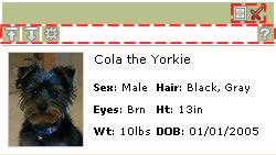
We'll use the icon-block to build a custom non-modal window that contains a photo and descriptive text. Other than providing a visual cue for mouseover, mouseout and click, the icons aren't "hooked up" and so don't do anything more.


Though you see seven images, there
are only two that are loaded. The icons are treated as background images each in a BiToolBarButton which of course are found in a BiToolBar.

The highlighted dashed lines indicate the two toolbars


We build the toolbar as we normally do, but this time instead of specifying a separate image for each icon, we'll use a transparent GIF. Then, we'll specify the background image by positioning the icon-block in the correct location.

Here's how we do it "inline" using the setStyleProperty(property, value) method found in BiComponents --


Of course, you can and should pull all the inlining out and then put them in a theme --


where the class names and selector rules associate with appearances. Here are the ones for the expand and close tab menu buttons --


Repeat this process for each icon and you're done! Note that we've only shown how this applies to toolbars, but you can apply it to almost anything.

Keep in mind that it's best to have predictable images ( i.e. the icons should be same size, etc. ). It makes it easier to apply this technique.

You can get all the associated code including the theme here. To see the example go here.

Have fun!