The idea is that you load small icon-blocks and from those blocks, use the icons as images in your application. This allows you to load the images once rather than making separate requests for each image.
As front end web developers, we know that reducing the number of HTTP requests is very important. As Yahoo!'s first Performance Research noted, "Reducing the number of HTTP requests has the biggest impact on reducing response time and is often the easiest performance improvement to make."
Matthew's technique uses background images and a little CSS to display icons.
We can easily apply the same technique in Bindows especially for components like toolbars, menus and buttons.
First, we'll choose an icon-block. Matthew used this one and so will we
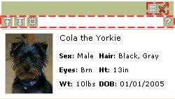
 We'll use the icon-block to build a custom non-modal window that contains a photo and descriptive text. Other than providing a visual cue for mouseover, mouseout and click, the icons aren't "hooked up" and so don't do anything more.
Though you see seven images, there are only two that are loaded. The icons are treated as background images each in a BiToolBarButton which of course are found in a BiToolBar.
The highlighted dashed lines indicate the two toolbars

We build the toolbar as we normally do, but this time instead of specifying a separate image for each icon, we'll use a transparent GIF. Then, we'll specify the background image by positioning the icon-block in the correct location.
Here's how we do it "inline" using the setStyleProperty(property, value) method found in BiComponents --
Of course, you can and should pull all the inlining out and then put them in a theme --
where the class names and selector rules associate with appearances. Here are the ones for the expand and close tab menu buttons --
Repeat this process for each icon and you're done! Note that we've only shown how this applies to toolbars, but you can apply it to almost anything.
Keep in mind that it's best to have predictable images ( i.e. the icons should be same size, etc. ). It makes it easier to apply this technique.
You can get all the associated code including the theme here. To see the example go here.
Have fun!

No comments:
Post a Comment