I updated the Bindows AboutComponent ( the first part is found here ) to show properties associated with the Bindows component. These aren't nested at all and are shown as a long list. You can click on them and their values appear in the giant bubble dialog.
Of course, the properties are nothing more than what you would get with the "for (var p in object)" syntax. You can probably get the same information if you're using an IDE, but since I don't use an IDE and since it's convenient to associate the properties with the component, I added this feature.
The AboutComponent is also now resizable. I also brought back the column headers. You can increase the width and sort the column. After using it to debug a "real" Bindows application, I realized that the components and events can be very well nested! So, these changes were necessary to make the AboutComponent usable.
Here's what it looks like now --
Here are other examples --
BiButton
BiWindow
BiTabPane with Four Tab Pages
Custom Component
You can download the AboutComponent here. It's all zipped up so just unzip to the "samples" directory of your Bindows install.
Note that this component only works for Bindows 2.0 and above.
Have fun!
Showing posts with label web. Show all posts
Showing posts with label web. Show all posts
Tuesday, April 24, 2007

Friday, April 06, 2007
Seeing Your Bindows Application This Way
Almost everything useful that you do with Bindows requires you to create parent child relationships with components. In other words, to create "controls" you always end up adding components to other components. After all, one of the main functionalities of the toolkit is to build visual controls that express behavior ( without behavior, your application is just another pretty face ).
For example, if you wanted to use a window component, you would instantiate BiWindow and then add it to the BiApplicationWindow. Like all components, BiWindow has a number of event listeners that provide behavior.
That got me thinking. Wouldn't it be nice to know the parent child relationships of a Bindows component or application? After all, that is one way of measuring how "big" your application is.
Or better yet, wouldn't it be nice to know the total number of events, the event types and their event handlers for application you're writing? Sometimes, your application is so big that it's tedious to go through the code, look at the events and then review the handlers.
So, I came up with a little reusable component called "AboutComponent" ( I thought about Bindow Eyes but people might think that this has something to do with a screen reader but it doesn't! ) that does just that --
I've used it to look at out-of-the-box Bindows components. Here's one for BiWindow --
Here's another with the BiTabPane component with four tab pages --
Of course, it's really useful and fun to analyze your own components. Here's my imitation of the Yahoo! movie rater ( this is also their "Hover Invitation" UI Pattern; read more about it here ) --
What does this all mean?
The first tab shows the parent child relationships or how the components contain each other. It doesn't show inheritance or how the component extends/derives. So, if you're looking at a BiButton, what you won't see is anything pertaining to a BiLabel or BiComponent. Why? Well, those aren't added as children to BiButton.
So, if you wanted to see the whole structure tree, you'd need to check BiComponent and BiLabel separately.
But, the tree does show you all the children found in your component and does show you the "structure" of your design.
The second tab shows all the events that the components are listening for. You can click on each event and a list of the event handlers show up. You can use this to see if you've accidently added unnecessary event handlers. Instead of scanning possibly a large code base, this immediately tells you how many events ( and what they do ) and how they associate with the component.
Remember, adding an event listener doesn't replace/remove previous ones! There's always a symmetry involved. If you add an event, you have to remove it explicitly ( by calling the method removeEventListener() ) or implicitly ( by disposing of the component or calling the removeAll() method from the parent component ).
How do you use it?
All you do is instantiate the AboutComponent with the component that you're interested in. Here's one where we pass a BiWindow component as a parameter to AboutComponent --
Pretty simple.
Now, you might be wondering how all this works. It's pretty straightforward. First, you can find all the children in a component by calling the getChildren() method. It's available for all BiComponents. Then, for each child, you call getChildren(), and then repeat ( i.e. recurse ).
You do this a n times and build up your tree. Here's an example of how I built the component tree for the first tab --
For the second tab, we do the same sort of thing. Only now, we're also after the events. Every BiComponent is a BiEventTarget and so contains event listeners -- a multidimensional array hashed on the event name and a key.
With that information, you can access an object literal representing the event handler and the "this" object. In other words, the "_listener" object contains the arguments passed to the method addEventListener(evtName, fHandler, [obj]).
Here's how we do it in the method getEventHandlers() --
Of course, we're pretty dependent on whether Bindows continues to handle their event in the same way. In general, it's not a good idea to directly access internal data structures like _listeners.
It's this way today ( Bindows 2.55 ), but tomorrow, who knows.
I hope you find this useful. You can download everything here. Unzip them into the "samples" directory of your Bindows library. You'll see a directory called AboutComponent. All the HTML files there are examples. So, click and run!
You'll find AboutComponent defined in AboutComponent.js. I've tested this only on Bindows 2.55 ( Just an update. AboutComponent won't work in pre-2.5 versions of Bindows. I'll look into that and update AboutComponent in the next few days ).
If you want to see the four examples without downloading the ZIP file, you can go here --
Feel free to use and improve it. I'd love to hear your feedback. If you do use it, let people know where you got it.
Have fun!
For example, if you wanted to use a window component, you would instantiate BiWindow and then add it to the BiApplicationWindow. Like all components, BiWindow has a number of event listeners that provide behavior.
That got me thinking. Wouldn't it be nice to know the parent child relationships of a Bindows component or application? After all, that is one way of measuring how "big" your application is.
Or better yet, wouldn't it be nice to know the total number of events, the event types and their event handlers for application you're writing? Sometimes, your application is so big that it's tedious to go through the code, look at the events and then review the handlers.
So, I came up with a little reusable component called "AboutComponent" ( I thought about Bindow Eyes but people might think that this has something to do with a screen reader but it doesn't! ) that does just that --
- Shows the parent child relationship in a component/application ( all components added to the parent )
- Shows the total number of events that the component is listening for, the total number of events that each child is listening for and their event handlers
I've used it to look at out-of-the-box Bindows components. Here's one for BiWindow --
Here's another with the BiTabPane component with four tab pages --
Of course, it's really useful and fun to analyze your own components. Here's my imitation of the Yahoo! movie rater ( this is also their "Hover Invitation" UI Pattern; read more about it here ) --
What does this all mean?
The first tab shows the parent child relationships or how the components contain each other. It doesn't show inheritance or how the component extends/derives. So, if you're looking at a BiButton, what you won't see is anything pertaining to a BiLabel or BiComponent. Why? Well, those aren't added as children to BiButton.
So, if you wanted to see the whole structure tree, you'd need to check BiComponent and BiLabel separately.
But, the tree does show you all the children found in your component and does show you the "structure" of your design.
The second tab shows all the events that the components are listening for. You can click on each event and a list of the event handlers show up. You can use this to see if you've accidently added unnecessary event handlers. Instead of scanning possibly a large code base, this immediately tells you how many events ( and what they do ) and how they associate with the component.
Remember, adding an event listener doesn't replace/remove previous ones! There's always a symmetry involved. If you add an event, you have to remove it explicitly ( by calling the method removeEventListener() ) or implicitly ( by disposing of the component or calling the removeAll() method from the parent component ).
How do you use it?
All you do is instantiate the AboutComponent with the component that you're interested in. Here's one where we pass a BiWindow component as a parameter to AboutComponent --
Pretty simple.
Now, you might be wondering how all this works. It's pretty straightforward. First, you can find all the children in a component by calling the getChildren() method. It's available for all BiComponents. Then, for each child, you call getChildren(), and then repeat ( i.e. recurse ).
You do this a n times and build up your tree. Here's an example of how I built the component tree for the first tab --
For the second tab, we do the same sort of thing. Only now, we're also after the events. Every BiComponent is a BiEventTarget and so contains event listeners -- a multidimensional array hashed on the event name and a key.
With that information, you can access an object literal representing the event handler and the "this" object. In other words, the "_listener" object contains the arguments passed to the method addEventListener(evtName, fHandler, [obj]).
Here's how we do it in the method getEventHandlers() --
Of course, we're pretty dependent on whether Bindows continues to handle their event in the same way. In general, it's not a good idea to directly access internal data structures like _listeners.
It's this way today ( Bindows 2.55 ), but tomorrow, who knows.
I hope you find this useful. You can download everything here. Unzip them into the "samples" directory of your Bindows library. You'll see a directory called AboutComponent. All the HTML files there are examples. So, click and run!
You'll find AboutComponent defined in AboutComponent.js. I've tested this only on Bindows 2.55 ( Just an update. AboutComponent won't work in pre-2.5 versions of Bindows. I'll look into that and update AboutComponent in the next few days ).
If you want to see the four examples without downloading the ZIP file, you can go here --
Feel free to use and improve it. I'd love to hear your feedback. If you do use it, let people know where you got it.
Have fun!
Sunday, March 04, 2007
Bindows 3.0 Beta :: Animating Yahoo's Expanding and Collapsing Tabs
I was fortunate enough to be one of the lucky ones to test drive the Bindows 3.0 Beta. The 3.0 version has some significant new features --
I was most interested in the animation library. I'm a big fan of the UI Design Patterns from Yahoo! and a lot of their patterns involve relocating, resizing and fading control elements. All this required the ability to animate which until now, Bindows lacked.
The example we'll imitate is taken from Yahoo! (they do practice what they preach!). It's the expanding/collapsing grid menu tabs found on the Yahoo! home page. Here's our imitation which I'm sure you'll recognize --
Mouseover the tabs and you'll see the animated expanding and collapseing tabs at work. Note that the tab pane content is static. They're just images, but in reality, they can be any component.
You can find the real version here.
There are three types of component animation found in Bindows 3.0. You can --
Note that animators aren't components. They animate BiComponents or their derivatives. So, think of animators as objects that provide resizing, relocating and fading behavior to components. We'll see how we use these animators in a minute.
From our implementation, you'll notice that there are three components that are resized and one component that is relocated.
The resized ones include the container for the grid tab menu and the "middle body", the area between the first and the bottom tabs --
 It also includes the area below the bottom tabs ("bottom body") --
 With that in mind, here's how the grid tab menu behaves.
Mouseover the top menu buttons and the grid tab menu container and the middle body increase in size, while at the same time, the bottom menu buttons move down making way for the middle body.
Mouseover the bottom menu buttons and if the top menu buttons are collapsed, the bottom body and the grid tab menu container increase in size.
If the top menu buttons are expanded, mouseover the bottom menu buttons and the middle body collapses, the bottom menu buttons move up, the bottom body and the grid tab menu container expand.
All of the animation is synchronous meaning that the components move together. This is important because it just wouldn't look right if the animations occurred at different times and rates.
For the three resizeable components ( grid tab menu container, middle and bottom body ), we'll use three BiSizeAnimators. For the bottom menu tab buttons, which we move up and down, we'll use a BiLocationAnimator. Here is the bottom menu tab highlighted within a dashed box --
 Here's the code for creating a BiSizeAnimator for the grid tab menu container --
Basically, you pass in the "from" and "to" widths and heights. These make up the first four parameters. The fifth parameter is the speed of the animation. We've chosen to use BiSizeAnimator.SPEED4 which is pretty fast. SPEED1 is the slowest and SPEED5 is the fastest.
The sixth parameter determines whether we want the resizing to autostart. In our case, we don't want that. We'll start the resizing ourselves. So, we set that to false.
The seventh parameter deals with acceleration. We want our acceleration to be constant all the way. So, we've chosen BiComponentAnimation.CONSTANT_SPEED. We could have chosen FAST_TO_SLOW, SLOW_TO_FAST or SLOW_TO_SLOW.
The eighth parameter associates the component with the animation. In this case, we're animating the BiComponent tabMenuContainer.
The final parameter sets frames per second. For this example, setting this value to 100 works nicely.
More information on the BiSizeAnimator can be found here.
We initiate the the grid tab menu container resize when we call the method start() --
It's important that we call start() in the right place and for us, we call it when we expand the middle or the bottom body. Here, for example is the code for expanding the middle body --
The bottom body has something similar (sizeAnimator2) --
The constructor for the BiLocationAnimator is identical to the BiSizeAnimator. They differ only in the value of the fifth parameter. In the BiLocationAnimator, we use the string "fastest" rather than the BiSizeAnimator.SPEEDX primitive constant.
More information on BiLocationAnimator is found here.
I noted earlier that all "the components move together." To do that, we start the animations one after another --
Where sizeAnimator resizes the middle body and as noted earlier, sizeAnimator3 resizes the grid menu tab container. The locationAnimator moves the bottom tab menu up or down.
If you review the BiLocationAnimator constructor for the locationAnimator, you'll notice that it's set to move from top to bottom. However, we don't always want to go in that direction.
We can change when we need to by calling the method setToFrom to go from bottom to top before calling start() --
Notice also that the locationAnimator listens for the "animationend" event. "animationend" is an important animation event because many times, you want to immediately perform an action after an animation.
In our case, we'll display the image in the tab pane using the showContentHandler event handler.
You can review the entire code here. The implementation is found here.
Note that we're using a modified theme based on the "Beige" theme provided in the toolkit. You can review that here. I added the three selector rules at the bottom of the theme.
Also, remember that this example requires Bindows 3.0 Beta. It will not work with earlier versions of Bindows.
As always, feel free to modify, use, comment and improve on the example. If you do use, just let them know where you got it.
Have fun!
- An animation library
- Vector graphics support for all browsers
- Advanced gauge support for all browsers
- Enhanced charting capabilities
- An improved grid panel component for better layout performance
I was most interested in the animation library. I'm a big fan of the UI Design Patterns from Yahoo! and a lot of their patterns involve relocating, resizing and fading control elements. All this required the ability to animate which until now, Bindows lacked.
The example we'll imitate is taken from Yahoo! (they do practice what they preach!). It's the expanding/collapsing grid menu tabs found on the Yahoo! home page. Here's our imitation which I'm sure you'll recognize --
Mouseover the tabs and you'll see the animated expanding and collapseing tabs at work. Note that the tab pane content is static. They're just images, but in reality, they can be any component.
You can find the real version here.
There are three types of component animation found in Bindows 3.0. You can --
- Resize components
- Change component location
- Visually fade components
- BiSizeAnimator
- BiLocationAnimator
- BiOpacityAnimator
Note that animators aren't components. They animate BiComponents or their derivatives. So, think of animators as objects that provide resizing, relocating and fading behavior to components. We'll see how we use these animators in a minute.
From our implementation, you'll notice that there are three components that are resized and one component that is relocated.
The resized ones include the container for the grid tab menu and the "middle body", the area between the first and the bottom tabs --
 It also includes the area below the bottom tabs ("bottom body") --
 With that in mind, here's how the grid tab menu behaves.
Mouseover the top menu buttons and the grid tab menu container and the middle body increase in size, while at the same time, the bottom menu buttons move down making way for the middle body.
Mouseover the bottom menu buttons and if the top menu buttons are collapsed, the bottom body and the grid tab menu container increase in size.
If the top menu buttons are expanded, mouseover the bottom menu buttons and the middle body collapses, the bottom menu buttons move up, the bottom body and the grid tab menu container expand.
All of the animation is synchronous meaning that the components move together. This is important because it just wouldn't look right if the animations occurred at different times and rates.
For the three resizeable components ( grid tab menu container, middle and bottom body ), we'll use three BiSizeAnimators. For the bottom menu tab buttons, which we move up and down, we'll use a BiLocationAnimator. Here is the bottom menu tab highlighted within a dashed box --
 Here's the code for creating a BiSizeAnimator for the grid tab menu container --
Basically, you pass in the "from" and "to" widths and heights. These make up the first four parameters. The fifth parameter is the speed of the animation. We've chosen to use BiSizeAnimator.SPEED4 which is pretty fast. SPEED1 is the slowest and SPEED5 is the fastest.
The sixth parameter determines whether we want the resizing to autostart. In our case, we don't want that. We'll start the resizing ourselves. So, we set that to false.
The seventh parameter deals with acceleration. We want our acceleration to be constant all the way. So, we've chosen BiComponentAnimation.CONSTANT_SPEED. We could have chosen FAST_TO_SLOW, SLOW_TO_FAST or SLOW_TO_SLOW.
The eighth parameter associates the component with the animation. In this case, we're animating the BiComponent tabMenuContainer.
The final parameter sets frames per second. For this example, setting this value to 100 works nicely.
More information on the BiSizeAnimator can be found here.
We initiate the the grid tab menu container resize when we call the method start() --
It's important that we call start() in the right place and for us, we call it when we expand the middle or the bottom body. Here, for example is the code for expanding the middle body --
The bottom body has something similar (sizeAnimator2) --
The constructor for the BiLocationAnimator is identical to the BiSizeAnimator. They differ only in the value of the fifth parameter. In the BiLocationAnimator, we use the string "fastest" rather than the BiSizeAnimator.SPEEDX primitive constant.
More information on BiLocationAnimator is found here.
I noted earlier that all "the components move together." To do that, we start the animations one after another --
Where sizeAnimator resizes the middle body and as noted earlier, sizeAnimator3 resizes the grid menu tab container. The locationAnimator moves the bottom tab menu up or down.
If you review the BiLocationAnimator constructor for the locationAnimator, you'll notice that it's set to move from top to bottom. However, we don't always want to go in that direction.
We can change when we need to by calling the method setToFrom to go from bottom to top before calling start() --
Notice also that the locationAnimator listens for the "animationend" event. "animationend" is an important animation event because many times, you want to immediately perform an action after an animation.
In our case, we'll display the image in the tab pane using the showContentHandler event handler.
You can review the entire code here. The implementation is found here.
Note that we're using a modified theme based on the "Beige" theme provided in the toolkit. You can review that here. I added the three selector rules at the bottom of the theme.
Also, remember that this example requires Bindows 3.0 Beta. It will not work with earlier versions of Bindows.
As always, feel free to modify, use, comment and improve on the example. If you do use, just let them know where you got it.
Have fun!
Monday, January 29, 2007
Animated Picture Slider :: Pre-Bindows 3.0
Recently, Bindows released their 3.0 Beta. This new flavor of Bindows comes with a lot of good things including a animation library that allows you to move, resize and fade any BiComponent.
It's pretty powerful and I'll write about that later in the weeks to come. For now, I'll cook up a little practical use of animation with a picture slider control built from the trusty Bindows 2.5 library.
The picture slider is an implementation of Yahoo!'s "Slide Transition" UI Design Pattern. It's also a knockoff of a slider widget in Yahoo! Games. Our control looks like this --
We'll get photos using the Flickr API (this is a RESTful API and returns XML) and get photos from one of my favorite photographers - Nikographer [Jon]. Jon takes great pictures.
Using the API, we'll load only nine and display only three images at a time. We'll also have an indicator to let people know the context of where they are when viewing the slides. These are the three small dots located at the upper right near the left and right buttons.
For navigation, we have the buttons. Clicking on one brings into the view the next three. The movement of the "next three" is animated so the slides actually move to position. They don't just appear and disappear.
In fact, things in real life seldom disappear and appear. Things transition into place.
When we mouseover the photo, a larger version will display to the right of the picture slider (you can't really see it from the small example above because it's cropped, but you'll see it if you go here). We'll also make the mouseover photo slightly opaque so that you know you're "doing something."
Likewise, when we mouseout, the large photo disappears.
With the general description out of the way, we'll focus our discussion on how we animate the slide control. We're not going to talk about how we construct the control or how we use the Flickr API. I'll provide you with the source and you can peruse that at your leisure. Like all Bindows applications, this one is pretty straightforward.
So, let's talk about the animation. First, we're not using any vector graphics (SVG or VML). We're also not using the canvas tag. We're just going to put images and their titles into a container and then add them to a grid panel. Then, we'll move them by changing their left position.
In Bindows-speak, this is taking a BiImage (a photo from Nikographer), its title (BiLabel) and putting them into a BiComponent. We'll add the BiComponent into a BiGridPanel (creatively called pictureSliderPanel).
When we're done, the BiGridPanel will contain nine BiComponents with photos and titles.
Here's how we setup the grid panel --
sliderWindow is the display window. It'll be wide enough to display only three images and the spaces between them.
Here's how we add slides to the grid panel. Once the XML is aysnchronously loaded from Flickr using BiXmlLoader, we'll call the addSlide method --
To "animate", we'll use the power of absolute positioning to move the grid panel to the left or right simply by changing the left CSS property when we press on the left or right button.
The setLeft() method abstracts this for us so we don't have to worry about calling setStyleProperty().
The sliding is actually done by using a timer. The timer goes to sleep and then wakes up and when it's awake, it'll update the left property. In the example above, we're decrementing so, we're moving left.
We'll stop the slide, when we reach a certain count number. This is what the constant SLIDE_AMOUNT is for. When that occurs, we stop the timer, reset the counter and get out of the loop.
About the loop. The loop is used to speed up the animation. The higher that number is, the faster the slide.
That's it.
You can see the example here. You can get the source here.
Feel free to use, modify and study it. If you do use it, let them know where you got it from.
Enjoy!
It's pretty powerful and I'll write about that later in the weeks to come. For now, I'll cook up a little practical use of animation with a picture slider control built from the trusty Bindows 2.5 library.
The picture slider is an implementation of Yahoo!'s "Slide Transition" UI Design Pattern. It's also a knockoff of a slider widget in Yahoo! Games. Our control looks like this --
We'll get photos using the Flickr API (this is a RESTful API and returns XML) and get photos from one of my favorite photographers - Nikographer [Jon]. Jon takes great pictures.
Using the API, we'll load only nine and display only three images at a time. We'll also have an indicator to let people know the context of where they are when viewing the slides. These are the three small dots located at the upper right near the left and right buttons.
For navigation, we have the buttons. Clicking on one brings into the view the next three. The movement of the "next three" is animated so the slides actually move to position. They don't just appear and disappear.
In fact, things in real life seldom disappear and appear. Things transition into place.
When we mouseover the photo, a larger version will display to the right of the picture slider (you can't really see it from the small example above because it's cropped, but you'll see it if you go here). We'll also make the mouseover photo slightly opaque so that you know you're "doing something."
Likewise, when we mouseout, the large photo disappears.
With the general description out of the way, we'll focus our discussion on how we animate the slide control. We're not going to talk about how we construct the control or how we use the Flickr API. I'll provide you with the source and you can peruse that at your leisure. Like all Bindows applications, this one is pretty straightforward.
So, let's talk about the animation. First, we're not using any vector graphics (SVG or VML). We're also not using the canvas tag. We're just going to put images and their titles into a container and then add them to a grid panel. Then, we'll move them by changing their left position.
In Bindows-speak, this is taking a BiImage (a photo from Nikographer), its title (BiLabel) and putting them into a BiComponent. We'll add the BiComponent into a BiGridPanel (creatively called pictureSliderPanel).
When we're done, the BiGridPanel will contain nine BiComponents with photos and titles.
Here's how we setup the grid panel --
sliderWindow is the display window. It'll be wide enough to display only three images and the spaces between them.
Here's how we add slides to the grid panel. Once the XML is aysnchronously loaded from Flickr using BiXmlLoader, we'll call the addSlide method --
To "animate", we'll use the power of absolute positioning to move the grid panel to the left or right simply by changing the left CSS property when we press on the left or right button.
The setLeft() method abstracts this for us so we don't have to worry about calling setStyleProperty().
The sliding is actually done by using a timer. The timer goes to sleep and then wakes up and when it's awake, it'll update the left property. In the example above, we're decrementing so, we're moving left.
We'll stop the slide, when we reach a certain count number. This is what the constant SLIDE_AMOUNT is for. When that occurs, we stop the timer, reset the counter and get out of the loop.
About the loop. The loop is used to speed up the animation. The higher that number is, the faster the slide.
That's it.
You can see the example here. You can get the source here.
Feel free to use, modify and study it. If you do use it, let them know where you got it from.
Enjoy!
Thursday, January 11, 2007
Smart Scrolling with Bindows
Smart scrolling is the concept of navigating through a large data set (usually a list or grid) by using scroll bars rather than by pagination. The idea is that scroll bars are more "natural" at navigation because they're already there.
Yahoo!'s Bill Scott, most notable for his UI patterns work, blogs about it here ("Rico's LiveGrid"). You can see real life implementations of it as well. Live.com uses the concept for its image searching and the Google Reader uses it for long feed lists.
With Bindows, we can create our own "LiveGrid." We do this by using any of the Bindows trees or grids. To populate and then navigate the grid, we'll get data asynchronously and because our data source returns the JSON format, we'll use the JSON loader component.
Where will we get the data? We'll get it from Yahoo!. They have a great search API which conveniently returns results in JSON.
So, the three things we'll be focusing on are --
So, let's look closer at the details. Because "smart scrolling" deals with scrolling, it's obvious that we need to be able to listen for and handle scroll events.
In particular, we'll handle vertical and ignore horizontal scrolling. We'll asynchronously fetch a row (in our case, we'll fetch 15 rows) when we scroll down. When we scroll up, we just scroll the data up. No fetching is done.
The grid that we'll use is really a tree -- BiTree2. There's no particular reason why we chose that component. We could have easily chosen BiTree, BiGrid or even BiGrid2 (similar to BiTree2 but has table/grid properties). The functionality that you want will dictate which component you use. In our case, BiTree2 fits nicely.
So, here's how we create our grid. It's pretty straightforward --
Now, to populate the grid, we'll use data from the Yahoo! Search API. You can read more about the API here, but basically, it's a RESTful API.
We'll submit a asynchronous search request (we're using an proxy server based on Yahoo!'s Search example) and tell the API that we want our results back as JSON. Then, we'll go through that data and take out the pieces that we want and add them to the grid.
To do the Ajax part, we'll use BiJsonLoader. We'll first submit the request through BiJsonLoader and then listen for the load event. The load event fires when the data is all there --
Once we have the data, it's just a matter of parsing the JSON formatted data and extracting what we want. It's pretty easy --
The final piece is handling scrolling. Here's the code --
The first few lines of the event handler handleScrolling effectively ignores horizontal scrolling. When it happens, immediately return.
The rest of the handler deals with vertical scrolling. Basically, we're comparing the position of the previous scrollTop with the current scrollTop. If the current scrollTop is greater than the previous scrollTop, then we call the method searchForward which asynchronously requests the next search results. Otherwise, we do nothing or return.
You can see the example here (I'm using Bindows 2.5).
The code is found here.
Feel free to use it and if you have comments, let me know. I only ask that if you do use it, let them know where you got it from.
Have fun!
Yahoo!'s Bill Scott, most notable for his UI patterns work, blogs about it here ("Rico's LiveGrid"). You can see real life implementations of it as well. Live.com uses the concept for its image searching and the Google Reader uses it for long feed lists.
With Bindows, we can create our own "LiveGrid." We do this by using any of the Bindows trees or grids. To populate and then navigate the grid, we'll get data asynchronously and because our data source returns the JSON format, we'll use the JSON loader component.
Where will we get the data? We'll get it from Yahoo!. They have a great search API which conveniently returns results in JSON.
So, the three things we'll be focusing on are --
- Creation of the grid
- Asynchronously populating the grid (Ajax!)
- Handling scroll events
So, let's look closer at the details. Because "smart scrolling" deals with scrolling, it's obvious that we need to be able to listen for and handle scroll events.
In particular, we'll handle vertical and ignore horizontal scrolling. We'll asynchronously fetch a row (in our case, we'll fetch 15 rows) when we scroll down. When we scroll up, we just scroll the data up. No fetching is done.
The grid that we'll use is really a tree -- BiTree2. There's no particular reason why we chose that component. We could have easily chosen BiTree, BiGrid or even BiGrid2 (similar to BiTree2 but has table/grid properties). The functionality that you want will dictate which component you use. In our case, BiTree2 fits nicely.
So, here's how we create our grid. It's pretty straightforward --
Now, to populate the grid, we'll use data from the Yahoo! Search API. You can read more about the API here, but basically, it's a RESTful API.
We'll submit a asynchronous search request (we're using an proxy server based on Yahoo!'s Search example) and tell the API that we want our results back as JSON. Then, we'll go through that data and take out the pieces that we want and add them to the grid.
To do the Ajax part, we'll use BiJsonLoader. We'll first submit the request through BiJsonLoader and then listen for the load event. The load event fires when the data is all there --
Once we have the data, it's just a matter of parsing the JSON formatted data and extracting what we want. It's pretty easy --
The final piece is handling scrolling. Here's the code --
The first few lines of the event handler handleScrolling effectively ignores horizontal scrolling. When it happens, immediately return.
The rest of the handler deals with vertical scrolling. Basically, we're comparing the position of the previous scrollTop with the current scrollTop. If the current scrollTop is greater than the previous scrollTop, then we call the method searchForward which asynchronously requests the next search results. Otherwise, we do nothing or return.
You can see the example here (I'm using Bindows 2.5).
The code is found here.
Feel free to use it and if you have comments, let me know. I only ask that if you do use it, let them know where you got it from.
Have fun!
Sunday, December 24, 2006
Wet and Dry UI
I use screen wipes to clean my monitors. These are the wet/dry systems that you find at your local office supply store. I typically do it every week and I don't look forward to it.
It's not because it's messy or that it takes a lot of time. It's because I have to figure out which one is the "wet" and the "dry" pad. The two pad system is very frustrating because even though I've been doing a lot, I still have trouble figuring it out.
It's best to show you what the two pad system looks like --

Which one is the wet and which one is the dry?
Well, if you look closely, the one on the right is the wet (actually, the resolution is horrible, but take my word for it. The wet one is on the right). Right before the French instructions, you'll see the words "Wet Wipe."
It's the same for the dry.
The problem with the "UI" is that the font is way too small -- for everything. Second, in the area where differential occurs (i.e. "Wet" and "Dry"), these areas look identical.
Where visual differences are required to provide distinction, it's best to make them stand out. Especially when you're relying on typography to guide the user, it's best to highlight the areas where you want your users to look (and act).
People look for visual clues to do things. By making the font properties identical (size, weight, color, etc.), you leave the impression that the two wipes have the same importance and that order doesn't matter when in fact they do.
The wet pad is on the right. If that pad is used first, shouldn't that pad be on the left? At least for the U.S., that makes sense.
When we design UI, we need to think about how we can make it easier for our users to do what they need to do. For the screen cleaning system, the most basic of that is letting the user know, "Hey, the pad on the left is the wet one. Use that first."
It's not to switch the order of things and make the font super tiny so that its difficult to read. Screen wipes are supposed to be easy to use.
It's not because it's messy or that it takes a lot of time. It's because I have to figure out which one is the "wet" and the "dry" pad. The two pad system is very frustrating because even though I've been doing a lot, I still have trouble figuring it out.
It's best to show you what the two pad system looks like --

Which one is the wet and which one is the dry?
Well, if you look closely, the one on the right is the wet (actually, the resolution is horrible, but take my word for it. The wet one is on the right). Right before the French instructions, you'll see the words "Wet Wipe."
It's the same for the dry.
The problem with the "UI" is that the font is way too small -- for everything. Second, in the area where differential occurs (i.e. "Wet" and "Dry"), these areas look identical.
Where visual differences are required to provide distinction, it's best to make them stand out. Especially when you're relying on typography to guide the user, it's best to highlight the areas where you want your users to look (and act).
People look for visual clues to do things. By making the font properties identical (size, weight, color, etc.), you leave the impression that the two wipes have the same importance and that order doesn't matter when in fact they do.
The wet pad is on the right. If that pad is used first, shouldn't that pad be on the left? At least for the U.S., that makes sense.
When we design UI, we need to think about how we can make it easier for our users to do what they need to do. For the screen cleaning system, the most basic of that is letting the user know, "Hey, the pad on the left is the wet one. Use that first."
It's not to switch the order of things and make the font super tiny so that its difficult to read. Screen wipes are supposed to be easy to use.
Tuesday, December 19, 2006
Cool Blue Nile Sliders
One of the most successful luxury consumer sites is Blue Nile. Who would have thought that buying diamonds was something that people would want to do on the internet, but they do.
One of the really cool things about Blue Nile is that they have some really innovative ways to filter data (in this case - diamonds). The filtering is asynchronous (AJAX), but it's their filtering control that we'll be looking at.
Here it is --

Here's the link to their filtering widget.
With the Bindows 2.5 or 3.0 Toolkit, we'll build a reusable component like what Blue Nile has. Here are a few of them built with our component -- FilterSlider --
The first thing we notice is that the Bindows library doesn't offer a slider with two thumbs. BiSlider only has one thumb, but we can set a property to make it a vertical or a horizontal slider.
What we'll do is take two of these vertical sliders and stack them on top of each other. We'll set the maximum and the minimum value to be the same. In fact, they'll be the same in almost everything (size, location, etc.), but the value. This way one of them is the top and the other is the bottom thumb.
The code looks complicated, but it really isn't. The sliders are placed inside a slider body which is nothing more than a BiComponent. Inside the FilterSlider, we also have two "odometers" which are BiLabels that display slider values. These change dynamically as the slider value changes.
Last but not least, we have a "topBg" and a "bottomBg." These are the backgrounds for the thumbs. That is, when we slide the thumb, the background expands and collapses depending on the direction that we're going.
The other important piece is how we select the thumb. Because the sliders are on top of each other, we have to first determine the position of the pointer and then from that determine which thumb we're on. We can't simply have the slider listen for the "change" event.
Whenever we dispatch a mousemove or a mousedown event in FilterSlider, we determine where we are. If we are over a thumb, we set that thumb to have a higher z-index than the other thumb.
The thumb with the higher z-index "wins" and so, that thumb listening for the change event (i.e. slide, maximum or minimum value change) will react.
With a little styling we get this.
The implementation is found here and the test driver is here. To get the images, just view the source and follow the links.
Feel free to use and improve on the code. Just let them know where you got it from.
Enjoy and Happy holidays!
One of the really cool things about Blue Nile is that they have some really innovative ways to filter data (in this case - diamonds). The filtering is asynchronous (AJAX), but it's their filtering control that we'll be looking at.
Here it is --

Here's the link to their filtering widget.
With the Bindows 2.5 or 3.0 Toolkit, we'll build a reusable component like what Blue Nile has. Here are a few of them built with our component -- FilterSlider --
The first thing we notice is that the Bindows library doesn't offer a slider with two thumbs. BiSlider only has one thumb, but we can set a property to make it a vertical or a horizontal slider.
What we'll do is take two of these vertical sliders and stack them on top of each other. We'll set the maximum and the minimum value to be the same. In fact, they'll be the same in almost everything (size, location, etc.), but the value. This way one of them is the top and the other is the bottom thumb.
The code looks complicated, but it really isn't. The sliders are placed inside a slider body which is nothing more than a BiComponent. Inside the FilterSlider, we also have two "odometers" which are BiLabels that display slider values. These change dynamically as the slider value changes.
Last but not least, we have a "topBg" and a "bottomBg." These are the backgrounds for the thumbs. That is, when we slide the thumb, the background expands and collapses depending on the direction that we're going.
The other important piece is how we select the thumb. Because the sliders are on top of each other, we have to first determine the position of the pointer and then from that determine which thumb we're on. We can't simply have the slider listen for the "change" event.
Whenever we dispatch a mousemove or a mousedown event in FilterSlider, we determine where we are. If we are over a thumb, we set that thumb to have a higher z-index than the other thumb.
The thumb with the higher z-index "wins" and so, that thumb listening for the change event (i.e. slide, maximum or minimum value change) will react.
With a little styling we get this.
The implementation is found here and the test driver is here. To get the images, just view the source and follow the links.
Feel free to use and improve on the code. Just let them know where you got it from.
Enjoy and Happy holidays!
Monday, December 11, 2006
Custom Bindows View Port
I was surfing for UI design patterns besides those offered by the great Bill Scott and his team at Yahoo and found Jenifer Tidwell's Designing Interfaces . Her book describes a number of design patterns one which we all use a lot -- "Overview Plus Detail."
You might not have known the name, but if you've used Google or Yahoo! Maps, you're using this pattern.
The way that the pattern works is that the map is the detail part and the little view port located at the lower right or the upper left is the overview part of the pattern. You use this pattern when there is a large amount of spatial information, but you can't see it all. So, thru the view port, you navigate to specific parts of the data.
Jenifer has a great description of it here.
As of this writing (I am using Bindows 2.5), Bindows doesn't have a BiViewPort, but we can easily create one. We'll use it to navigate a randomly generated graph created from the Bindows graphical API.
Let's look at the design details.
First, let's decide how large we want our virtual view area to be. The virtual area is the place where we'll put the graph. Let's make it 5000x5000 pixels. Obviously, we won't be able to see the graph in its entirety (at least with any meaning; besides, how many people have monitors capable of displaying a graph that size!), but we'll be able to see a portion of the graph as wide and as high as the screen.
Then, we'll need a way to navigate the virtual area. This is where the overview window comes in. We'll need an overview window and then a little viewport to navigate the virtual area.
Basically, the overview window is the virtual area in miniature. Likewise, the viewport is a little miniature "screen." Because they're miniatures, we have to properly scale them so they look and react proportionally just like the real thing.
The overview window and the viewport are pretty simple. They're just BiComponents. The viewport is added to the overview window. Here's the code --
Notice that we've hardcoded a size to the overview window (ex. overview.setSize(200, 200)). This is fine as long as the viewport is properly scaled based on the overview and the graph size. This is what we're doing with the function getMultiple() --
The function returns the number of times that the graph is bigger than the overview. We use the multiple to scale down the viewport like this --
You might not have known the name, but if you've used Google or Yahoo! Maps, you're using this pattern.
The way that the pattern works is that the map is the detail part and the little view port located at the lower right or the upper left is the overview part of the pattern. You use this pattern when there is a large amount of spatial information, but you can't see it all. So, thru the view port, you navigate to specific parts of the data.
Jenifer has a great description of it here.
As of this writing (I am using Bindows 2.5), Bindows doesn't have a BiViewPort, but we can easily create one. We'll use it to navigate a randomly generated graph created from the Bindows graphical API.
Let's look at the design details.
First, let's decide how large we want our virtual view area to be. The virtual area is the place where we'll put the graph. Let's make it 5000x5000 pixels. Obviously, we won't be able to see the graph in its entirety (at least with any meaning; besides, how many people have monitors capable of displaying a graph that size!), but we'll be able to see a portion of the graph as wide and as high as the screen.
Then, we'll need a way to navigate the virtual area. This is where the overview window comes in. We'll need an overview window and then a little viewport to navigate the virtual area.
Basically, the overview window is the virtual area in miniature. Likewise, the viewport is a little miniature "screen." Because they're miniatures, we have to properly scale them so they look and react proportionally just like the real thing.
The overview window and the viewport are pretty simple. They're just BiComponents. The viewport is added to the overview window. Here's the code --
Notice that we've hardcoded a size to the overview window (ex. overview.setSize(200, 200)). This is fine as long as the viewport is properly scaled based on the overview and the graph size. This is what we're doing with the function getMultiple() --
The function returns the number of times that the graph is bigger than the overview. We use the multiple to scale down the viewport like this --
Now, here comes the really important part. We need to take care of navigation. This means that we need to move the viewport and once we're done moving the view port, we move the graph.
For the first part, the viewport listens for the dragstart event. Once that event fires, a number of things happen --
- The viewport is made movable (i.e. added as BiMoveHandle)
- The movable component listens for the moveend event
When the move ends, we take the location of the viewport and then scale up to match the position of the virtual area so that the screen can display the same nodes found in the viewport. Here's what all this looks like --
The linkMgr is the BiLinkManager. In other words, it's the graph container. We're moving this entire component which contains all the elements that make up a graph (nodes and edges).
We're done!
One thing you'll notice is that I didn't talk about creating graphs. The folks at Bindows have some terrific tutorials, examples and documentation on that. You can also review my source.
When you do, you'll also note that I use two additional components which I didn't mention -- originalPos and navWinInfo. The first one is just a BiComponent which marks the position that the viewport was at (that's the gray box which you'll see in the prototype). The second one is just a BiLabel which displays current xy coordinates.
You can find the prototype here (be sure and maximize your browser - F11). Feel free to study and use the source. If you do, let them know where you got it.
Enjoy and have fun!
Monday, November 27, 2006
Creating a Google Gadget Tips-Like Widget :: Part 2 :: Making It Reusable
In the first part, we looked at how we could create the Google Gadget Tips-Like Widget using the Bindows JavaScript toolkit. Unfortunately, what we created wasn't reusable (i.e. we couldn't instantiate it to make more of the same thing) which made the component pretty useless (a component is synonymous with a widget; Bindows uses the word component to mean widget). However, our prototype did demonstrate functionality and that's what it was supposed to do.
If you missed the first part, you can find it here.
In this second part, we'll take what we've done and make it so that we can create any number of components with something simple like this --
To start, we need to think about what the developer will use the component for. Here are a number of things that he'll want do with our custom component (let's call this the VerticalTabComponent) --
So, armed with that information let's derive VerticalTabComponent from BiComponent.
Basically, we need to put the members and functions from BiComponent into the prototype scope of VerticalTabComponent. We'll also need to call the BiComponent constructor (function) on behalf of the derived component like this --
We'll also expose a few privileged functions (these are like public functions but have access to private members) --
Notice the granularity of the functions. Most of them return derivatives of BiComponent rather than objects like String (i.e. the tab button label, etc.). As we noted in the first part, "BiComponent is by far the most useful component in Bindows."
Of course, much of what we expose to the developer is based on how much we wish to abstract. For example, look at these two functions --
Why on earth would we want to set the background color this way when we can use the power of CSS?
As it turns out in this case, we do want to hide some of the details. When we set the background color for the VerticalTabComponent, what we're really doing is setting the background color for an internal container. This is something that the developer shouldn't worry about.
You'll also notice that we only expose functions. We didn't expose any of the member variables. We want to control what the developer has access to and directly grabbing member variables is not what we want.
We've also removed almost all of the inline styling and placed them in an external CSS file. Bindows uses the concept of themes and to use that we need to define an appearance which is nothing more than a selector rule found in the CSS file within the theme.
So, we'll define the appearance and then make sure that the selector rule is the same name as the appearance. Here's one example of how we create appearances. This one is for the internal container --
Within the theme.css file, we'll add these selector rules --
If you look in the VerticalTabComponent, we did keep a few inline styles --
We did this to styles that change the state of the component that are independent of the theme.
In general, when we make a reusable component, we should do our best to move the styles out of the code and into an external file. In essence, what we are telling the users of our component is that these selector rules are free for you to modify.
Lastly, we'll have a few event handlers to deal with behaviors like dragging, mouseovers and mouseouts --
We're now ready to create the component and with a single line of code we have magic --
If we wanted to create a look different from the default "Google", that too is easy, but a bit wordy. Here's the code for a "Meebo" (http://www.meebo.com/) like look --
That's all there is to it. If you're interested in the example, the implementation is found here.
You can download the entire sample here (including the VerticalTabComponent). Of course, you'll need the Bindows JavaScript Toolkit. My example uses Bindows 2.5, but any version of Bindows should work. Have fun!
If you missed the first part, you can find it here.
In this second part, we'll take what we've done and make it so that we can create any number of components with something simple like this --
To start, we need to think about what the developer will use the component for. Here are a number of things that he'll want do with our custom component (let's call this the VerticalTabComponent) --
- Use their own grabber
- Give the grab label a completely different name
- Customize content in the tab pane
- Control background (and foreground) color
- Replace the default close button with something more snazzy
- Etc.
So, armed with that information let's derive VerticalTabComponent from BiComponent.
Basically, we need to put the members and functions from BiComponent into the prototype scope of VerticalTabComponent. We'll also need to call the BiComponent constructor (function) on behalf of the derived component like this --
We'll also expose a few privileged functions (these are like public functions but have access to private members) --
Notice the granularity of the functions. Most of them return derivatives of BiComponent rather than objects like String (i.e. the tab button label, etc.). As we noted in the first part, "BiComponent is by far the most useful component in Bindows."
Of course, much of what we expose to the developer is based on how much we wish to abstract. For example, look at these two functions --
Why on earth would we want to set the background color this way when we can use the power of CSS?
As it turns out in this case, we do want to hide some of the details. When we set the background color for the VerticalTabComponent, what we're really doing is setting the background color for an internal container. This is something that the developer shouldn't worry about.
You'll also notice that we only expose functions. We didn't expose any of the member variables. We want to control what the developer has access to and directly grabbing member variables is not what we want.
We've also removed almost all of the inline styling and placed them in an external CSS file. Bindows uses the concept of themes and to use that we need to define an appearance which is nothing more than a selector rule found in the CSS file within the theme.
So, we'll define the appearance and then make sure that the selector rule is the same name as the appearance. Here's one example of how we create appearances. This one is for the internal container --
Within the theme.css file, we'll add these selector rules --
If you look in the VerticalTabComponent, we did keep a few inline styles --
We did this to styles that change the state of the component that are independent of the theme.
In general, when we make a reusable component, we should do our best to move the styles out of the code and into an external file. In essence, what we are telling the users of our component is that these selector rules are free for you to modify.
Lastly, we'll have a few event handlers to deal with behaviors like dragging, mouseovers and mouseouts --
We're now ready to create the component and with a single line of code we have magic --
If we wanted to create a look different from the default "Google", that too is easy, but a bit wordy. Here's the code for a "Meebo" (http://www.meebo.com/) like look --
That's all there is to it. If you're interested in the example, the implementation is found here.
You can download the entire sample here (including the VerticalTabComponent). Of course, you'll need the Bindows JavaScript Toolkit. My example uses Bindows 2.5, but any version of Bindows should work. Have fun!
Friday, November 10, 2006
Creating a Google Gadget Tips-Like Widget
I recently had to rebuild my laptop which meant reinstalling software including the very useful Google Desktop.
During the installation, the Desktop installed Google Gadgets and the "tips" dialog --
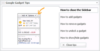 Basically, the dialog is a series of help screens accessed by mousing over the vertical tabs. You really can't put too much information in each pane, but I thought that the vertical tabs were unique and worth imitating for a web application.
To do that, I'll use the Bindows JavaScript toolkit. Originally created by Erik Arvidsson, it's an incredibly complete and powerful DHTML/Ajax framework for building web applications. It's definitely not the only one around (i.e. Dojo, Tibco's General Interface, etc.), but I use it everyday and I'm pretty familiar with it.
(For this post, I'm not going to go into the basics of how to build a Bindows application. Yoram Meraiz and his Team at MB Technologies have great tutorials and a lot of examples to get you started.)
Whenever I "imitate" or prototype something, the first thing I do is look at the behavior of the thing. All the visualizations (i.e. the "pretty" things) come last. So, from the Google's help dialog, we know that our model --
During the installation, the Desktop installed Google Gadgets and the "tips" dialog --
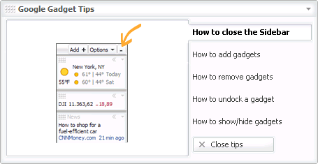 Basically, the dialog is a series of help screens accessed by mousing over the vertical tabs. You really can't put too much information in each pane, but I thought that the vertical tabs were unique and worth imitating for a web application.
To do that, I'll use the Bindows JavaScript toolkit. Originally created by Erik Arvidsson, it's an incredibly complete and powerful DHTML/Ajax framework for building web applications. It's definitely not the only one around (i.e. Dojo, Tibco's General Interface, etc.), but I use it everyday and I'm pretty familiar with it.
(For this post, I'm not going to go into the basics of how to build a Bindows application. Yoram Meraiz and his Team at MB Technologies have great tutorials and a lot of examples to get you started.)
Whenever I "imitate" or prototype something, the first thing I do is look at the behavior of the thing. All the visualizations (i.e. the "pretty" things) come last. So, from the Google's help dialog, we know that our model --
- Will listen for events (i.e. mouseover a tab and the pane changes)
- Can be dragged (another event is dispatched)
- Can be closed by clicking a button
- Has text for each tab and the title of the dialog
- Has images for content in each tab pane
- To listen for events, we will need a BiComponent
- To drag the dialog, we will need a BiComponent
- To close the dialog, we will need a BiButton (a derivative of BiComponent)
- For the titles, we will need a bunch of BiLabels (another derivative of BiComponent)
- For the content in the tab pane, we will need a bunch of BiImages (another derivative of BiComponent) as well
It's a pretty good bet that we'll use BiComponents.
The BiComponent is by far the most useful component in Bindows for a number of reasons --
- A BiComponent understands events. In other words, a BiComponent listens for and can dispatch events
- A BiComponent can add other BiComponents. This means that they can function as a group (i.e. they can be dragged, hidden together, etc.)
- A BiComponent can be styled inline (naughty, naughty) or by selector rules (i.e. via a CSS file or in Bindows parlance, a theme)
Let's take a look at how we use the BiComponent to imitate the Google help dialog.
First, we'll take advantage of the fact that we can add components together. So, we start out by creating a container to hold all the other parts of the dialog. Not surprisingly, the container is a BiComponent --
Then, we look at what should be in the container. The dialog's label and grabber area are no brainers. We'll use a BiLabel and a BiImage for those and add them to the container --
The same goes for the close button. It's easy --
Now, let's look at the tab button and the tab pane. They're related in that when you mouseover the button, the content changes in the pane. So, what we'll do is create another container that holds the tab button, the tab pane and the content.
We will repeat this for each tab (there are five). Of course, we'll need to add this to our container. One benefit of doing it this way, is that we can add all the tab components and then they can be positioned together in one shot.
Note that each tab is already built up. In other words, we're not going to build them up when they are needed (i.e. when a mouseover occurs). We'll just use the power of CSS and style them so that they do not display if they're not moused over --
For now, the code uses a lot of inline styles and as an early prototype, that's fine. Right now, what we're after is to imitate behavior and look and not the reuse or maintainence of the component. Eventually, when we take this prototype and make it a reusable component/widget, we'll worry about that.
Let's look at how we handle the behavior for the tabs. When we mouseover the tab button, a number of things happen --
The text in the tab button is bolded The tab pane appears with the new content The previously selected tab is no longer bolded and its content is no longer displayed
Here it is translated into code for one of the tabs --
The last behavior is dragging the dialog and doing that in Bindows is easy. We just add the container to a BiMoveHandle component --
We've omitted the close button, but essentially it listens for the onclick event and in our case, simply displays an alert box that says "Clicked!"
That's it. What we end up with is our implementation and you can view the full source here.
In an upcoming entry, I'll address how we can turn this prototype into something reusable so that you can use it in your own code (we'll also get rid of the inline styling too).
Subscribe to:
Posts (Atom)

