One of it's main features is the animation library. I'd written about it before.
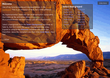
To celebrate 3.0's release, I've put the animation library to good use by using their three animators - BiSizeAnimator, BiOpacityAnimator, and BiLocationAnimator - and created this dashboard.

It's an imitation of the cool looking IconDB Dashboard ( IconDB never had animated "transitions"; so, I've added these in various places of my example ).
Here's some functionality from the example.
Observe change in opacity by selecting a background from the Select Background container. Watch the background fade out and then watch the new one fade in.
Click on the expand button in the Welcome container and watch as the container transitions to an expanded container. Then, collapse and watch it shrink.
Drag one of the containers. Then, drag the other. Do this as many times as you'd like and then click on Undo Move. Watch as containers move back to their previous positions.
There's a lot in this example, but rather than talk about the design of the dashboard or how it's constructed ( I'll blog about that in a later entry ), for now, I'll focus on the animation library.
The animation tutorials on the Bindows site are excellent, but they focus on the declarative ( XML ) piece. With the dashboard example, we'll see how to use it with the JavaScript API. This will supplement the tutorials.
One of the nice things about the animators is that they're separate from the components. They animate BiComponents. So, if you've built a custom component from an earlier version of Bindows, you don't need to change your component to use the animator. You just simply switch to Bindows 3.0, construct an animator by passing in the component and then start the animation.
General Pattern
In general, the constructor for the three animators follow this pattern --
BiAnimator([parameters for the type of animation], nSpeed, bLoop, nAccType, oComp, nFrameRate, bAutoStart)
Each animation type -- Size, Opacity and Location -- requires specific parameters to be passed and so, they differ depending on the type of animation that we want to do.
nSpeed is how fast you want your animation to occur in milliseconds. You can set it directly as a number or a constant ( i.e. BiSizeAnimator.SPEED1, BiOpacityAnimator.SPEED1, BiLocationAnimator.SPEED1, etc. Note that the speed constants differ depending on the type of animation ). You can even use strings - "slowest", "slow", "normal", "fast" and "fastest."
You can repeatedly do the animation by passing bLoop as true. In the dashboard example, all the animators have this set to false.
You can set acceleration, nAccType, for your animation. Typically, the animation is run at "constant speed" meaning that throughout the entire animation cycle, the animation is done in the same speed. You can accelerate, decelerate or "go slow then fast then slow" by using these constants - BiComponentAnimation.SLOW_TO_FAST, BiComponentAnimation.FAST_TO_SLOW, BiComponentAnimation.SLOW_TO_SLOW. Constant speed is BiComponentAnimation.CONSTANT_SPEED.
oComp is simply the component that the animator acts upon. Only BiComponents can be animated.
nFrameRate is the number of frames per second for the animation. We'll use the default -- BiFpsGenerator.DEFAULT_FRAME_RATE. Just pass in a natural number. We can play with this setting to get a "smooth" animation. In the dashboard example, using the default frame rate results in a smooth animation.
bAutoStart allows you to auto start the animation. We typically set this as false because we want to control when we want to start the animation.
It's Event Driven
So far, we've looked at what properties we can set on an animator. Though this is useful, it doesn't tell us how to interact with the animator. An animation is useless if you can't control it.
Starting an animation is easy -
Construct an BiComponent Construct an animator ( by passing in the parameters to the constructor as described above ) Call the start() method
The animation starts and then ends., but how do we know when it ends?
We'll listen for the "animationend" event. When that occurs, we can perform our next set of operations in the event handler. In the next section, we'll see in the dashboard example how we do this.
Note that during the animation, the animators constantly fire the "frameprogression" event. If we want, we can check for that, but in our example, we don't do that.
Opacity
The dashboard's background opacity is controlled by the BiOpacityAnimator. Setting opacity allows you to fade components. Components can gradually fade in or fade out.
The fade out occurs when we select a background image ( ex. Olympia, etc. ). The current background fades out and once that animation ends, the fade in of the Olympia background begins.
Notice how the fadeOut animator listens for the "animationend" event. When that event is fired, the handleAnimationEnd method is invoked, which does three things --
- Starts the fade in animation
- Disposes the fade out animator
When the fade in completes, we dispose the fade out animator.
It's important to remember that the "animationend" event drives everything. We'll see this pattern in the other animations as well.
Change Size
You can change the size of the container by controlling the BiSizeAnimator. In the Welcome container, click on the collapse button at the upper right. You'll see that the container acts like a drawer closing. Click on the expand button and the animation goes the other way.
There's not much difference between this example and the opacity one. The opacity animator does have an extra last boolean parameter, bForward, which allows the animation to progress forward or in reverse ( fade out ).
Changing the Location
Changing the location of the container is done by using BiLocationAnimator. Move the containers around the dashboard. Then, click on Undo Move. The container moves back to their previous position.
You can review the opacity and the location animators here. The size animator is found here.
The example is here.
Have fun!
